The Role of Data Visualization in Effective Market Research Communication
6 August 2025
Let’s face it — we live in a world that’s drowning in data. From online behaviors to purchase patterns, businesses have access to more market data now than ever before. But here’s the catch: having data isn’t the same as understanding it.
That’s where data visualization steps in — like a translator for all that number-crunching magic.
When you're trying to convey crucial findings, tell compelling brand stories, or persuade stakeholders to get onboard with a strategy, data visualization can take your market research from a snoozefest of spreadsheets to a “wow” moment of clarity.
In this blog post, we’ll dig into how data visualization plays a powerful role in effective market research communication — and why it shouldn’t just be an afterthought.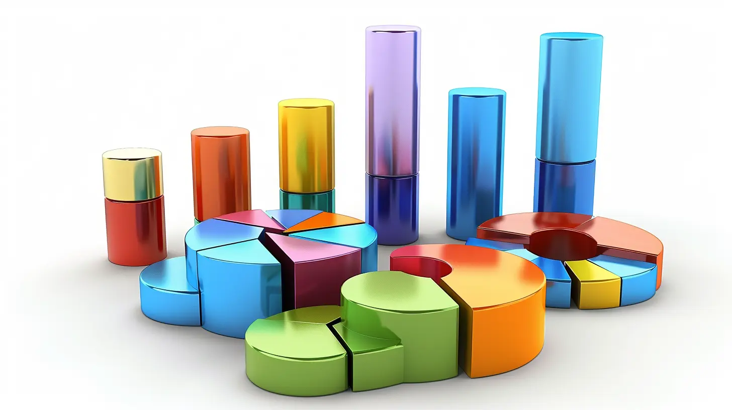
Why Market Research Is Useless Without Good Communication
Okay, that’s a bold statement — but stick with me.Market research, in its raw form, is typically messy. Think surveys, behavioral metrics, demographic data, competitor analysis — it’s exhaustive. And if you've ever tried presenting a 40-page report filled with text and tables, you’ve probably seen eyes glaze over faster than you can say “sample size.”
The truth is, data alone doesn’t drive decisions. Understanding it does.
So, when you communicate market research findings, your real goal is to guide others toward insights — not just dump stats on them. And visualizations? They’re the shortcut to that 'aha' moment.
What Is Data Visualization, Really?
Let’s break this down. Data visualization is the art (yep, art) of turning dry, complicated data into visual formats — like charts, graphs, infographics, heatmaps, and so on.But it's not just about making things look pretty. The real purpose is to:
- Highlight significant patterns or trends
- Make complex data digestible
- Get stakeholders to feel the story behind the numbers
Imagine trying to explain a year’s worth of customer feedback using only paragraphs. Now picture a word cloud or sentiment analysis graph that instantly shows the top pain points. Which one speaks louder?
Exactly.
Why Visualization Makes Communication More Powerful
1. Humans Process Visuals Faster
Here’s a wild stat: The human brain processes images 60,000 times faster than text. That means when you show someone a bar graph instead of listing revenue figures, they instantly grasp the comparison.It's like showing a movie trailer versus handing someone the script.
2. Better Engagement
Let’s be honest — nobody likes staring at walls of numbers (unless you’re a data scientist with top-tier caffeine levels). Visuals hold attention. They break monotony. They introduce color, contrast, and design elements that keep your audience curious.Think of it as the difference between reading a recipe and watching a cooking video.
3. Enhances Storytelling
Market research is a story waiting to be told. There’s a beginning (objective), a middle (data findings), and an end (insight-driven action). Data visualizations act like scene transitions — they keep your narrative smooth and compelling.By strategically placing a sleek line graph or an animated infographic, you make even the driest data feel relevant and emotional.
Types of Visualizations That Shine in Market Research
Let’s dive into a few practical examples.Bar and Column Charts
These are the go-to for comparing data across categories. Say you're looking at customer preference by product type — a bar chart shows the winner in an instant.Line Graphs
Great for tracking changes over time, like monthly sales or social engagement metrics. Perfect for spotting trends or seasonality.Pie Charts
Sometimes controversial in data circles, but when used right, pie charts offer a quick grasp of proportions — like market share or percentage-based feedback.Heat Maps
These are fantastic when you want to show intensity, like in website scroll tracking or regional popularity.Word Clouds
Ideal for qualitative data, especially customer feedback or social media comments. They give a voice to your audience — literally.Infographics
These are the rockstars of storytelling. When you have a lot to say but don’t want to bore your readers, infographics blend visuals, text, and flow.Case Study: How Visualization Made the Difference
Let’s say a company is launching a new coffee brand. They conducted surveys across four cities — lots of questions, piles of feedback. When their research team presented the findings, their slides were packed with bullet points and tables. The decision-makers? Barely paid attention.Then they revamped the presentation with visual dashboards — pie charts to show flavor preference, heat maps of geographic demand, even emotional expression graphs based on keywords from open-ended feedback.
Suddenly, the board was engaged. They started asking questions, connecting the dots, brainstorming. That’s the magic.
Common Mistakes to Avoid in Visualizing Market Research
Yes, visualizations are great — but just like good storytelling, there's a craft to it. Let’s go over what not to do.1. Overcomplicating the Visuals
Ever seen a chart with 12 data points jammed into a single graphic? It’s like trying to read a novel through a keyhole. Simplicity wins.2. Choosing the Wrong Chart
Pie charts for time-series data? Nope. Heat maps for categorical data? Meh. It’s not just what you visualize — it’s how.3. Ignoring Context
Numbers mean nothing without context. Always label your axes, explain your filters, and let the visual guide — not confuse — the viewer.4. Ditching Accessibility
Colorblind-friendly palettes, readable fonts, and mobile-friendly design matter. Don’t lose your audience because your chart is illegible on a phone.Best Practices for Using Visualization in Market Research Communication
Let’s get into the good stuff — how to do it right.Know Your Audience
Is your audience executives, marketers, or product developers? Each group cares about different insights. Tailor your visuals accordingly.Focus on Key Takeaways
Don’t throw the kitchen sink into your graph. Highlight the why behind the what. What's the insight? What does it mean for the business?Tell a Visual Story
Sequence your visuals to guide the viewer. Start with 'what we studied', then 'what we found', then 'why it matters'. Think of it like flipping through a visual comic book — each frame builds on the last.Use Interactive Dashboards (When Possible)
Tools like Tableau, Power BI, or Google Data Studio let stakeholders explore data on their own. Instead of a static chart, they can click, sort, and filter — it’s like giving them a steering wheel.The Emotional Power of Visuals
Here’s something we often overlook — data can be emotional.When you show that 70% of customers felt frustrated using your app — and you put that stat in bold font next to a sad-face emoji heat map — you’re not just informing, you’re evoking.
And emotion is a catalyst for change.
Don’t just think numbers. Think impact. Think influence. Think storytelling with heart.
Tools That Make Data Visualization a Breeze
You don’t have to be a graphic designer or a data scientist to create compelling visuals. Here are some everyday tools you can start with:- Canva – Perfect for beginners looking to create sleek infographics
- Google Charts – Free and easy to embed into presentations
- Datawrapper – Great for simple, clean charts with interactive features
- Tableau – Ideal for advanced, dynamic dashboards
- Power BI – Great for deep business analytics with visualization layers
Pick one that fits your skill level and need — and start visualizing!
Final Thoughts: Visualization Is the Bridge Between Data and Decision
Market research has always been about understanding your audience. But how you present that understanding can make or break its impact.Data visualization isn't just a bonus — it’s the glue that connects raw data to actionable strategy. It speaks louder than numbers, faster than paragraphs, and clearer than tables.
So next time you’re about to send out that research report or present your quarterly insights? Pause. Ask yourself: how can I show this, not just tell it?
Because a well-placed chart may just do more for your project than 2,000 words ever could.
all images in this post were generated using AI tools
Category:
Market ResearchAuthor:

Matthew Scott
Discussion
rate this article
1 comments
Luna Fuller
Great insights! Data visualization truly makes complex info accessible. Let's keep turning numbers into stories that inspire smart decisions!
August 30, 2025 at 2:48 AM
Matthew Scott
Thank you! I'm glad you found the insights valuable—data visualization indeed transforms complexity into clarity, driving informed decisions.